
You can Read Part One (Speeding Up Default WordPress) here.
Image files are still the bulk of page weight for most blogs. They are the majority of page weight for the average page on the internet:
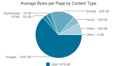
They will account for an even higher proportion of this page’s weight, given it’s full of screenshots about image weight.
Although it’s possible to squeeze the most speed out by delving into the guts of WordPress and cutting the chaff, for now we’re sticking to the things that we can control ourselves, with an emphasis on ease. This article mostly lists errors I wish I did not make with the images on this website and plugins that do things for us.
So how do we speed up our images on WordPress?
- We can make the images we use smaller, so that it takes less time to transfer them.
- We can serve images based on the needs of our users.
- We can serve images at the right time, making them seem faster.
Source Quality
The quality you’re using can probably be lower without upsetting your viewers. Reducing quality reduces filesize.

Look at the image above. This same stock image resaved at 80% quality (progressive) in Irfan viewer weighs less than a quarter of the original :

This is lossy. These images are the same dimensions. If you zoom in it does sort of maybe look worse. Enough for your audience to care? Probably not. Worth the speed tradeoff? Probably.

Taking it further may not be worth it for you. Something to keep in mind during the upload process – the performance vs quality equation is great here, but there is an investment of your time in doing this.
File Dimensions
By default WordPress creates multiple versions of each image uploaded based on your theme (the Small, Medium and Large options in the media center).
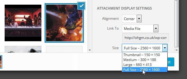
“Full Size” ignores this, even if it will ultimately be resized to the same dimensions as “Large” via your template’s CSS. It will still be loading the full-size image by default.
The solution is “size your images to the maximum width they will be displayed at before uploading them”. But I’m not ever going to do that, do I don’t expect you to do so. The more reasonable solution is not automatically using Full Size on upload except when necessary. If your image is sized below the ‘large’ default, use Full Size. If there is a large option available and you want it to be that size, use large.
If you don’t want to deal with going through all your old posts (I don’t either), then you can alleviate the issue by using RICG’s Responsive Images plugin.
In short, the plugin populates img’s srcset attribute with WordPress’s Small, Medium and Large images. Browsers then only download the best-fit image based on (among other things) the maximum width the image will ultimately be displayed at. One’s that can’t just stick to the src. They aren’t worse off as a result. For more information you can read my post about Srcset on WordPress.
File Format
This is generally a PNG vs JPG issue. If you’re using a screenshot tool for what you’re putting online, then it’ll have a default output setting. Mine defaults to whatever was used last:
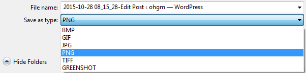
This means that it’s wrong about half of the time. To keep things simple, assume JPG will be better for busy images with lots of different colours (like photos). PNG will be substantially better for images without much colour detail – like the screenshot above.
If you want to test this, save a jpg photo to png. Quality won’t go down, but filesize will go up. Use the better format of the two when possible. I’m currently looking for a solution to automatically use the best one.
Progressive JPGs
 Instead of loading line-by-line (not actually), progressive JPG’s load a low quality version of the final image and progressively add more detail over a number of frames:
 This increases filesize, while making the image feel faster.
For a while they’ve been considered the Standard Best Practice – but users may have taken against them. As noted in a study on Webperformancetoday.com, Progressive JPEG resulted in unhappier users than baseline JPEG:
When, as with the Progressive JPEG method, image rendition is a two-stage process in which an initially coarse image snaps into sharp focus, cognitive fluency is inhibited and the brain has to work slightly harder to make sense of what is being displayed.
Something to consider.
Alternate Filetypes
There are a number of newer standards very slowly making headway into gaining browser support (e.g. WebP). They’ll usually have quality-size advantage over JPG, PNG and GIF formats, at the expense of lack of vendor support. This lack of userbase makes them foolish to blindly adopt.
There are four major browsers (Chrome, Firefox, Safari, Internet Explorer/EDGE), and four major browser vendors (Google, Mozilla, Apple, Microsoft). The four do not always agree.
If you do use a format they don’t agree on, you need a fallback to a format they do all agree on. Once I have an implementation on this blog I’m happy with, I’ll update this section (ignoring the fact that I spend most of my time in Firefox).
Image Optimisation
Images can shave weight without a perceivable loss in quality.
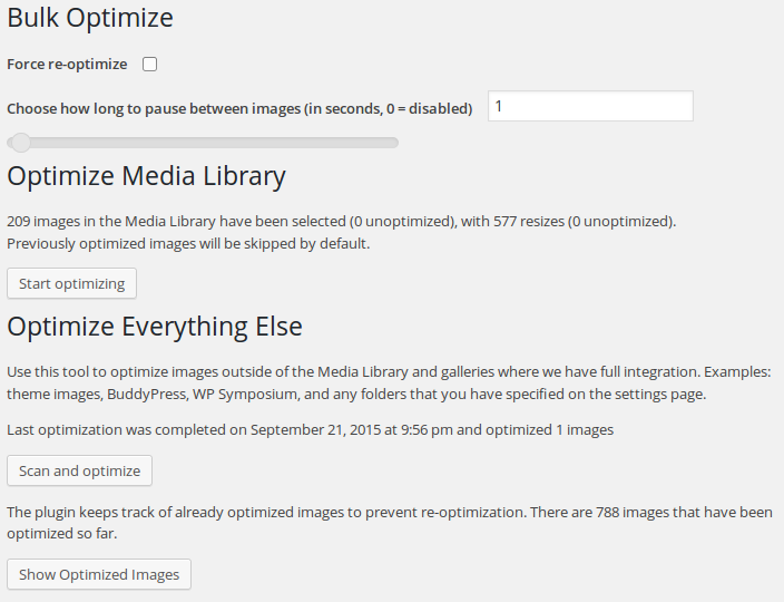
EWWW Image Optimizer will automatically run this compression for you on upload. Of the image optimisers I’ve tried on WordPress, it’s the best by a mile.
EWWW uses jpegtran, TinyJPG, JPEGmini, optipng, pngout, pngquant, TinyPNG, and gifsicle. It ships with precompiled binaries for most of these, so you don’t need elevated privileges to make use of it.
Besides running on upload, you can also run this in bulk on every image in your media gallery and every image based asset the plugin can find in your current theme:
 Install it, upset your server by running it on everything, forget about it.
Regarding Meta-Data
There’s a safe default in EWWW to keep meta-data intact.
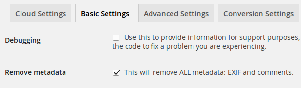 If you’re able to strip it, check this setting. There is no discernible loss in quality from doing this and the saving from doing so is surprisingly substantial.
I suspect the embedded meta-data is a very, very low key ranking signal. I don’t care about ranking in image search for any of my sites. Some people do. And some people need to keep EXIF data intact (e.g. for legal attribution or because they’re professional photographers). If this is you, leave this option as it is.
Lazy Loading
If you can’t make your images smaller, you can at least make them feel faster. Lazy loading does this by allowing the browser to request content based on the viewport. Instead of loading every image on the page, the browser loads and renders the images the user can see, plus a little more. The result? The page feels done quicker and (hopefully) the user doesn’t notice anything. The images have already loaded by the time the user gets to them.
I’m using BJ Lazy Load with the following settings:
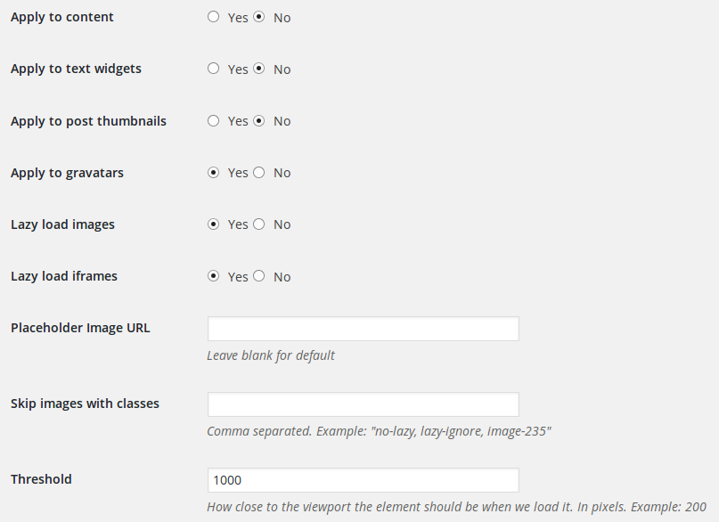
This ensures that browsers only request images once they are within 1000 pixels of the current viewport. It is fully compatible with srcset.
I previously wrote about IE not handling my srcset test very well:
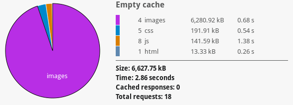
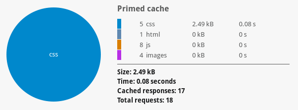
- Before lazy-loading was enabled, users on IE 11 downloaded 5949 KB.
- After lazy-loading was enabled, users on IE 11 downloaded 1242 KB.
Using the same test page and lazy loading IE 11 only needed to download the first two oversized images. This is a phenomenal saving. It doesn’t solve the root of the problem (your page is too heavy), but does a great job of smoothing it over without effort on your part.
Don’t Serve Images
The cheapest request is one you don’t make. Amazing! On that point….
Leverage Browser Caching
 It makes a difference.
Images don’t change much, so your users should be keeping them in their cache for a long time. Page views beyond the first on your site will be faster if all the theme assets load from cache near instantaneously.
The previous post in the series illustrates doing this with text-based static assets, but this can be set for media in W3 Total Cache‘s browser cache setting.
There is very little downside to doing this.
Use a CDN
Most browsers allow between 4 and 8 parallel connections from a single subdomain. One way to get around this is to use img.domain.com subdomains to serve the images in parallel.
If you want to experiment with this immediately, you can try enabling Jetpack’s photon module. Viewing the source you’ll see the images are being served from the subdomain – and dynamically resized to the specified dimensions, or the containing element (whichever is smaller). This can be quickly disabled.
Serving images from a subdomain means they can be downloaded in parallel with the rest of your content. This is not such an advantage when you are lazy loading your content, unless you are loading a huge number of connections at once.
Getting Weirder
We can get more esoteric. Contrast these two identically sized croppings:


It’s not purely about the dimensions of the image, but the detail contained. I’m not saying you should selectively crop images to gain speed, but it’s interesting to think about. More weirdness on orientation here (sorry).
In Conclusion:
- Use EWWW to automatically losslessly compress all images on upload.
- Use the smaller file format. Experiment with quality.
- Don’t use ‘Full Size’ when it doesn’t make sense.
- Use RICG’s srcset plugin so browsers only load images they’ll benefit from.
- Abuse Lazy-loading so browsers won’t load images until they need to.
- Have users cache image assets in their browsers so subsequent views feel faster.