I’m interested in speeding up WordPress. If you read around on the topic, you’ll find lots of advice on the bigger performance gains (enable server side caching, enable browser caching etc). I’m also interested in theoretical speed gains, too (here’s that post on saving GIFs at a 90 degree rotation and then rotating them back with CSS to save thousands of bytes).
Most sites are viewed on a number of different resolutions. Typically users on mobile devices will be forced to download all the desktop assets, which are then wrapped around a mobile theme. If the website is also trying to satisfy ‘retina display’ users, then sometimes they’ll be forcing images two or three times larger than necessary for the majority of users. This isn’t a great approach; often mobile users with the worst connections, smallest screens and weakest processors will have the most frustrating experience by design. I believe srcset can in part alleviate (not solve) this issue, and offer marginal speed gains for smaller screen resolutions.
Enter srcset
So, what is srcset?
Open this page, resize your browser and reload it. That’s srcset.
Srcset presents browsers with options for an image (“a1.jpg is 200px wide, a2.jpg is 400px wide, a3.jpg is 800px wide”). Browsers can then choose which image they should load based on what they know about the user (viewport width, screen resolution, orientation, connection speed, astrology). You can read more about it from Jake Archibald, here. It’s very clever.
Most importantly, it’s easy to set up on WordPress.
Srcset on WordPress
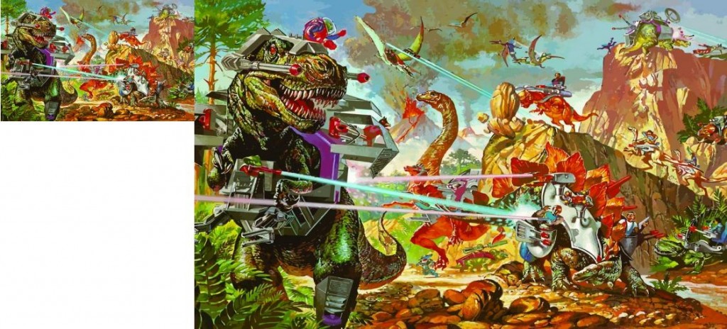
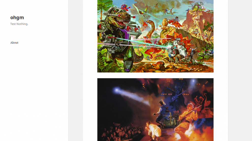
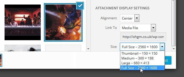
First I set up my srcset test page. It’s got pictures of dinosaurs and it weighs about 6MB thanks to the “Full-Size” image upload option.
Then, I install the Responsive Images plugin by RICG. This works (roughly) by using the “small, medium, large” copies of images WordPress generates as alternates for browsers to choose through the srcset attribute. Activating the plugin takes us from this:
<img class="aligncenter size-full wp-image-1257" src="https://ohgm.co.uk/wp-content/uploads/2015/10/dinoriders.jpg" alt="dinoriders" width="2880" height="1800" />
To this:
<img class="aligncenter size-full wp-image-1257" src="https://ohgm.co.uk/wp-content/uploads/2015/10/dinoriders.jpg" alt="dinoriders" width="2880" height="1800" srcset="https://ohgm.co.uk/wp-content/uploads/2015/10/dinoriders-300x188.jpg 300w, https://ohgm.co.uk/wp-content/uploads/2015/10/dinoriders-1024x640.jpg 1024w, https://ohgm.co.uk/wp-content/uploads/2015/10/dinoriders-825x510.jpg 825w, https://ohgm.co.uk/wp-content/uploads/2015/10/dinoriders.jpg 2880w" sizes="(max-width: 2880px) 100vw, 2880px" />
You can see that the alternate sizes have been inserted into the img tag as srcset values. Browsers which are confused by the information presented in srcset will simply fall back to loading and serving the src attribute.
Testing it’s working
We can test that this is working by using the performance monitoring tools built into Chrome and Firefox.
Chrome’s “Nexus 4 (384 x 567)” loads the following images:
- Dinos – 185 KB
- King Kong – 145 KB
- Star Wars 1 & 2 – 74.2 KB & 71.7 KB
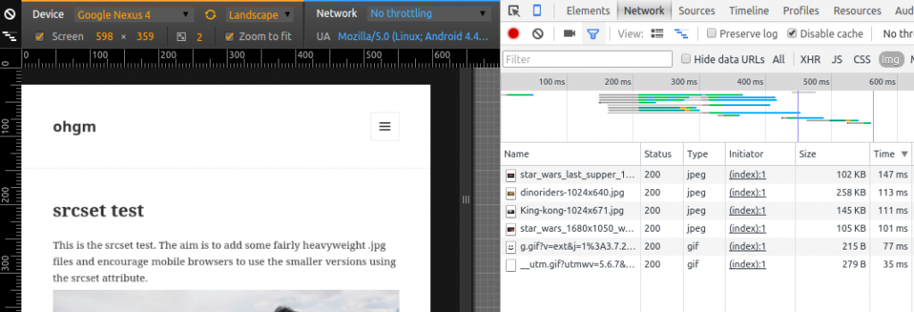
“Nexus 4 horizontal orientation (598 x 359)” loads:
- Dinos – 258 KB
- King Kong – 145 KB
- Star Wars 1 & 2 – 258 KB & 105 KB
This makes sense, as the new orientation will be able to benefit from the higher-resolution file versions. If you’re not so comfortable with the in-browser tools (or don’t trust them), you can use a service like Webpagetest. For our test Webpagetest.org gives me the following:
- Chrome users on a desktop downloaded 988 KB.
- Firefox users on a desktop downloaded 946 KB.
- Chrome users on a mobile device (Moto G) downloaded 757 KB.
- Users on IE 10 downloaded 5587 KB.
- Users on IE 11 downloaded 5949 KB.
As you might guess, IE doesn’t support srcset. Ignoring IE, a ~200 KB saving for the Moto G over modern desktop browsers is excellent given the effort involved.
This is worth hammering in – The benefit of using srcset is not limited to mobile devices. If it were, Chrome and Firefox on desktop would also be loading > 5MB in order to serve the badly coded test page up. Instead they smooth over our poor decisions, acting as a band-aid against “Full Size”.
By implementing srcset you will probably not be making things worse. If your blog has multiple authors who habitually use “Full Size” when uploading images, then enabling srcset could be a great move. The additional page weight of the text assets is not going to outweigh the gain from browsers only requesting the correct assets in the first place.
Browser vendors have a lot of wiggle room with how they implement srcset, so you will see different results from different browsers on the same device. The important thing is that vendors are moving in the right direction, and it’s better to try to serve appropriately sized images than not.
As a primer, I’d recommend reading Dave Newton’s post on Smashing Magazine regarding more efficient image resizing settings for ImageMagick. Besides being an excellent read, one of the outcomes of this post is an optional setting in RICG’s plugin for overwriting the default image resize behaviour in WordPress (which uses ImageMagick). I’ll be enabling this later, and seeing how it plays with EWWW Image Optimizer (I’m interested in keeping things lossless for now).
Some CDN’s really struggle with srcset, so you might have to weigh one against the other. Believe in yourself.
You can optimise things further by providing either a blank placeholder or super low res image and using javascript like picturefill to ensure older browers like IE replace it with the appropriate image from srcset.
Bear in mind there are a few drawbacks when doing this with srcset or the picture tag, namely that its not really supported by either Google or big social sites you may want your images appearing on, such as Google, Pinterest, Facebook and Twitter.
The last two you can overcome somewhat by supplying a higher resolution src in the oEmbed tags, and Pinterest has its own data-pin -media attribute, which though it works with its own plugin is sadly not supported by many ‘social sharing’ plugins and scripts.
Google images requires using a fallback image instead of a blank/base64 placeholder, which of course can mean duplicate downloads on a mobile which can make the whole thing a wee bit pointless.
Sorry Jonny, meant to reply earlier. Thanks for your comments!
The plugin makes use of picturefill by default, which is really nice. I’ll edit the post to add this in.
Didn’t know about data-pin -media, I’ll check that out.
I’ve had some mischevious ideas around Google ignoring everything but the src, but I’ll test these out.